Google Data Analytics Professional Certificate Capstone Project
Cyclistic Case Study
Introduction
For the capstone project, I have selected the Cyclistic bike share analysis case study to work on. For the case study, I will perform the real-world tasks of a junior data analyst for the marketing team at Cyclistic, a bike-share company in Chicago.
To answer key business questions, I followed the six steps of the data analysis process taught in the course which are: Ask, Prepare, Process, Analyze, Share and Act.
- Detailed documentation of code is available in GitHub.
- Initial analysis of datasets provided by Cyclistic using Microsoft Excel.
- Data cleaning, validation and exploration using Microsoft SQL.
- Data Visualization using Tableau Public.
Background
Cyclistic:
A bike share program that features around 5828 bicycles and 692 docking stations in 2016. Cyclistic differentiate itself from competition by also offering reclining bikes, hand tricycles, and cargo bikes. Most riders opt for traditional bikes and about 8% of riders use the assistive options. Cyclistic users are more likely to ride for leisure, but 30% use them to commute to work each day.
Lily Monero:
The director of marketing and responsible for development of campaigns and initiatives to promote the bike-share program.
1. Ask
Identify the business task:
Strategy to maximize the number of annual memberships by converting casual riders into annual riders.
Consider key stakeholders:
Lily Monero & the Executive team
Stakeholder perspective:
Monero believes company’s future success depends on maximizing the number of annual memberships. She believes rather than creating a marketing campaign targeting all new customers, there is a very good chance to convert casual riders into members
Questions to Analyze:
- How do annual members and casual riders use Cyclistic bikes differently?
- Why would casual riders buy Cyclistic annual memberships?
- How can Cyclistic use digital media to influence casual riders to become members?
Monero has assigned the first question for the junior data analyst to analyze.
2. Prepare
Data Source:
Past 12 month of original bike share dataset from 01/06/2020 to 30/05/2021 were extracted as 12 zipped .csv files. The data is made available and licensed by Motivate International Inc.
Data Organization & Description:
- File naming convention: Cyclistic_TripData_YYYYMM
- File Type: Converted from csv to xslx format to enable importation to Microsoft SQL.
- File Content: Each excel files contains 13 columns containing information related to ride id, ridership type, ride time and location and location etc. Number of rows varies between 49k to 531k from different excel files.
Data Security:
- Riders’ personal identifiable information is hidden through tokenization.
- Original files are backed up in a separate folder.
Data Limitations:
As riders’ personal identifiable information is hidden, thus will not be able to connect pass purchases to credit cards numbers to determine if casual riders live in the Cyclistic service area or if they have purchased multiple single passes.
3. Process
Tools I have selected for data verification and cleaning:
- Original files are backed up in a separate folder.
- Microsoft Excel
- Microsoft SQL server
Reasons:
- By scanning through data in Excel worksheet, the general outline and basic information can be found which enable me to get familiarize with the dataset. I can perform simple check on formatting, missing information, sorting and filtering from the spreadsheet as well.
- The 12 datasets combined will contain more than 4 million rows of data. Excel worksheet limitation is 1,048,576 rows.
- Thus, Microsoft SQL server is used to perform such task. Microsoft SQL server will be also used to extract and generate new table for desired information which will be used for data visualization via Tableau Public.
Initial assessment on the dataset in Microsoft Excel
Prior to data cleaning, I used number of rows in each excel sheet to present the total number of rides per month and plot it out using a simple bar chart. It Shows that ridership peaked in Aug 2020 and dropped to the lowest point in Feb 2021 which might have correlation with seasonal change, as weather slowly turn cold from Aug and spring arrives at around March. Keep this in might and check again after data is cleaned.

Data Verification in Microsoft Excel
- Check individual columns for the assigned data type.
- Check for invalid / incorrect / unusable data, remove them if necessary.
- Create a column named “ride length” which calculates the time period length of each ride.
- Create another column named “day_of_week” to calculate the day of the week
- Some columns contain empty cells which I have used the replace function in Excel to replace empty cell with “NULL” string. Some cells from start_station_name and end_station_name columns contains (*) or (Temp) or (LBS-WH-TEST) which meant for bike test or maintenance. All the mentioned have to be removed in the combined dataset.

- By using filter function, abnormalities in the ride_id column is spotted. Standard ride_id contains 16 characters. Take note to remove rows that does not contains 16 character for ride_id.

Data Cleaning and Data Manipulation using Microsoft SQL
I started with the WITH clause, the purpose is to better modularize each sub-query block by giving a name each so that it will be clearer for extraction in the later part.
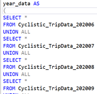
For the first sub-query, by using the UNION command, 12 month datasets from June 2020 to May 2021 are combined to form a yearly dataset.
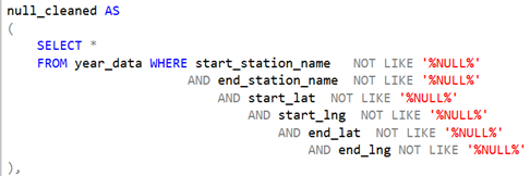
By scanning through the combined dataset, “NULL’ strings shows up from column start_station_name to end_lng. These rows of data are considered to be incomplete therefore should be removed. Command WHERE, NOT LIKE AND are used.
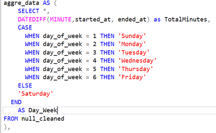
Next, I proceed to aggregate the data. To find out the ride length of each ride, DATEDIFF clause was used and defined in MINUTE. CASE clause is used to convert given condition into different strings from Monday to Sunday.
To ensure that all the ride_id only contains 16 characters, LEN command is used. There are some ride length which is less than 1 minutes. Those will be treated as error rides and filtered out.

To ensure there is no extra space in front or behind the string in station name, TRIM command is used. Replace command is used to replace (*) and (TEMP). NOT LIKE command to filter out the rows containing (LBS-WH-TEST). The sane operation is applied to end station column data.
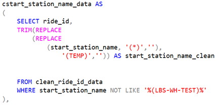
start station id and end station id are joined on ride_id to form station name subquery. Finally, the final table is formed by combining the station name with the rest of the data. This completes the part on data cleaning. The next part will focus on data exploration and data visualization.

4 & 5. Analyze & Share Insights
Analyze (Step 4) and Share (Step 5) are combined together in this section.
Tools I have selected for Data Exploration and Data Visualization:
- Microsoft SQL server
- Tableau Public
To analyze the cleaned data table, my first step is to find out how many member / casual cyclist are departing or arriving at different bike stations. I used COUNT and GROUP BY command to perform this operation.

Similar code is used to find out the number of member riders departing from different stations. Next step, I proceed to match the bike stations to their respective latitude and longitude. As some of the geographical coordinates contains varied accuracy to different decimal points, I used ROUND and AVG command to ensure that each bike station will only have an unique latitude and longitude.

Finally, combine the rider number with the respective geographical coordinates, and creating dashboards for data visualization in Tableau public.

For the visualization above, it presents the frequency of visit for casual riders at various bike stations. The bike stations with the highest rider visit frequency can be easily spotted. The top 5 location are stated and coincidently they are all located at close proximity to the coast of the lake. To have a better sense of for trips per station , slide the scroll bar to filter trips accordingly.
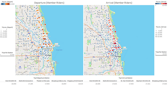
For the visualization above, it presents the frequency of visit for member riders at various bike stations. Compared to the Geodata for casual riders, the visits for respective bike stations are more spread out instead of concentrated at a few stations near the coast.
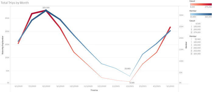
Next, I wanted to find out how the ridership for casual or member varies throughout the year accordingly. Thus, for the SQL query, I used COUNT command to count the number of casual riders, and group them by each day. The same is done for the member riders and both sub-queries are joined to form a new table to export to Tableau Public

From the Tableau Visualization, it indicated for both casual and member ridership peaked around August and hit the lowest at February before rebounding up sharply.
I would also like to know which day of the week has higher ridership.

From the Tableau Visualization, it shows that the trend for member riders is relatively consistent throughout the week, with a slight drop on Sunday. On the other. In contrast, for casual riders, weekdays bike trips are significantly lower compared for members, and peaking on Saturday and Sunday.

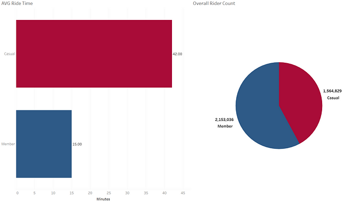
Finally, I would like to find out what is the average ride time and the total rider count for casual riders and member riders respectively. Average ride time for casual rider is significantly higher compared to member riders. More than half of all riders are member riders.
6. Act
Summary of the insights gained from Tableau Visualization
- Casual riders are more concentrated around the coast area, whereas member riders are more spread out around the office area. Casual riders also peaked during weekends, there is a high chance they are tourists or families who are visiting the coastline for leisure activities such as sightseeing during the weekend. Longer average ride time for casual rider provide further suggestion on the previous mentioned point.
- Ridership start to pick up from February and start to decrease in August. It might have correlation to the seasonal changes. As the weather start to get warmer in February (start of Spring), more riders starts to cycle, and inversely when the weather to start to turn cold in August (end of Autumn)
- Length of ride for members are relatively shorter compared to casual riders. This might be due to short ride transit from train stations to their offices / home for member rider type.
- More than half of the riders are members, indicating that the company have already sustained some level of loyalty among their bike users. Thus, the company has chance to convert more casual riders to members.
In additional to sharing the insights gathered to Lily Monero and the executive stakeholder. I would like to propose a few recommendations based on data evidence:
- Based on the trips made, the marketing campaign should be launched between February to August as the number of trips made by cyclists starts to build up.
- As casual rider usage often peaks on the weekend, the marketing campaign can include weekend only membership membership subscription at lower price to attract casual riders to convert to members
- Modification to membership subscription, such as ride length based charges which charges lesser as ride length increases. This provides more incentive for the member rides to cycle longer distances. With such modification, it could also encourage casual riders to convert to members to enjoy the ride length discounts.
Thank you for reading my case study project until the end, hope you have enjoyed it! (:
